My Creative Year So Far...
One of my goals for 2019 was to get my art room organized. It is an ongoing process, but I am making headway. I'll post pics once I get it to a point that I'm happy with.
As part of my organizing, I've been trying to use up bits and bobs that are hanging around my work space. I've made quite a few ATCs (artist trading cards), but have been spending more of my time lately making art journal pages. That is what I want to share about in this post.
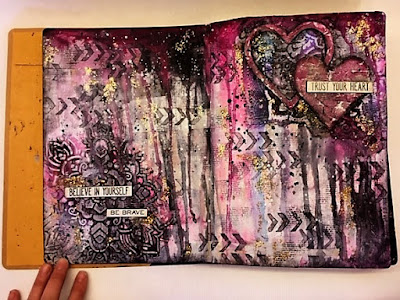
Another of my goals for 2019 was to art journal. My first prompt-free spread felt really forced. I think I was focused on creating a "pretty" page, but honestly it didn't inspire me. And it has been over a month since I had created another spread in my book.


February ATC challenge:

As part of my organizing, I've been trying to use up bits and bobs that are hanging around my work space. I've made quite a few ATCs (artist trading cards), but have been spending more of my time lately making art journal pages. That is what I want to share about in this post.
Another of my goals for 2019 was to art journal. My first prompt-free spread felt really forced. I think I was focused on creating a "pretty" page, but honestly it didn't inspire me. And it has been over a month since I had created another spread in my book.

Full spread

Detail
I don't hate the page, but it doesn't make my heart happy. My color choice puzzles me. It's just not what I like.
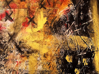
Recently, I've been watching a lot of videos by Hope Smitherman and SouthernGalsDesigns on YouTube. I've been HUGELY inspired and influenced by their art journaling, and I've been creating some pages that do make my heart happy. I've been using up bits and bobs around my desk in a single page series done on old greeting cards and packaging. My intention is to bind them together once I decide I'm finished. When will that be? I have NO IDEA.... I guess when I get sick of the size. As far as page size, I haven't been exact. They are 5 1/2 inches-ish by 5 3/4 inches-ish (I think - I'm too lazy to go down and measure them, so I'm relying on my less than reliable memory). I'm edging the backs in black so that when they are glued together, the packaging/cards will not be visible in the case of size differences.

Single page backs
I think you can see the progression from being more controlled to letting go and being more free in these pages. The grungier and messier they are, the more they make me happy. I'm pleased that I've been able to let go a bit more and scribble and push paint around with my fingers.


I decided to go back to my larger Dylusions journal (in which I created the first page above) and give it a go again. I like the direction that I'm moving in....

Full page spread

Detail

Texture Detail
This year I'm also participating in Art Joy of Sharing's Pick a Stick Challenge. February's prompts left me with a page that I was pleased with, but that started out a disaster. I really had to work through the uglies, take a break, and figure out how to work with the busy background I had created. Here is my art journal page for #PASC0219:

#PASC0219
The colors for the challenge were fuchsia and amber. The steps in order:
1. Knife: I used a palette knife to spread gesso around the page, creating texture.
2. Sand: After adding paint, I used sand paper to expose the texture from the gesso.
3. Geometric: I stenciled fuschia paint through a stencil with squares. That layer was pretty much covered up completely.
4. Stencil: I used yellow ochre through a mandala stencil.
5. Tissue: I glued a tissue paper that has a metallic fuschia colored pattern onto the background. I continued to add layers of paint and some washi tape before adding the final step.
6. Elephant: Negative painting with black gesso. I used charcoal, black stabilo, and white posca pen to bring out the lines of my elephant.
I finished it up by adding a quote by Graydon Carter with white charcoal around the elephant and black posca paint pen inside the elephant. The quotes says:
We admire elephants in part because they demonstrate what we consider the finest human traits: empathy, self-awareness, and social intelligence. But the way we treat them puts on display the very worst of human behavior.
February ATC challenge:

#PASCATC0219
Fuchsia was the ATC challenge color.
Steps, in order, were:
1. Blend ~I used gesso and then fuchsia colored paint to blend my collaged paper bits together for the background.
2. Sand ~ I used sand paper to distress the background and bring back some white through the fuchsia.
3. Geometric ~ I used a neon pink pen through a square stencil.
The butterfly was a bit of scrap that I added in my first layer. I decided to make it the focal point by outlining it and adding a scribble border around it with a fine liner. I also added white posca paint pen around it to make it stand out. Because it was a scrap of a badly stamped butterfly, I needed to cover up the left hand side of the upper wing. So I dripped some black fluid acrylic from the wing. I also used the fluid acrylic to add splatters.
Thank you for checking out my blog. I hope you enjoy sharing part of my journey with me. Please check out the videos from Shel and Peg at Art Joy of Sharing, Hope Smitherman, and Tiff at SouthernGalsDesigns for some major inspiration and enjoyable to watch videos.
I love them all. Love all the awesome creavitity. Great job!!
ReplyDeleteThank you!!!!! :)
Deletejen, i just bookmarked this wonderful page! really love your journey!!
ReplyDeletemarlies
Thank you :)
Delete